Visualizing the SaaS Review Avalanche: Turning Feedback into Clarity and Insight
The avalanche of software-as-a-service (SaaS) solutions has brought a parallel flood of user reviews, now a central pillar in how individuals and businesses evaluate technology. Crowdsourced opinions shape product trajectories and sales figures in subtle yet powerful ways. But the raw input, thousands of star ratings, written comments, and usage anecdotes, must be shaped into something approachable before it truly informs decisions. That is where data visualization steps in, translating the swirl of sentiment into patterns that resonate with both emotion and intellect.
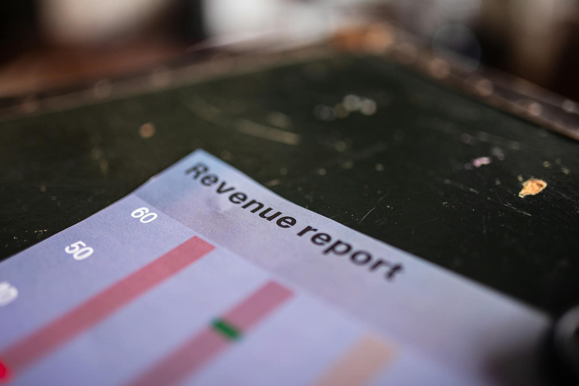
Even the simplest act of presenting SaaS review data involves choices with real consequences. Do you reduce everything to a classic five-star average, bold and prominent, perhaps accompanied by the number of participants? Do you show a histogram of ratings, a pie chart of user demographics, a scatterplot of feature importance versus satisfaction? Or do you take a step further, weaving sentiment analysis, temporal trends, and competitor benchmarking into composite dashboards?
The art and science of review visualization are now a field in their own right, honed by product managers, UX designers, and data journalists who grapple daily with the friction between overwhelming complexity and actionable clarity. Their lessons are not only vital for SaaS marketplaces and vendors but offer insight for anyone looking to communicate feedback-driven insights powerfully.
From Numbers to Stories: Why Visualization Matters
Humans crave stories, not spreadsheets. Raw review text holds the emotional immediacy, but the sheer volume is a barrier. We see this everywhere: buyers skip to star ratings, executives demand trends on a single slide, marketers hunt for pull-quotes. Visualization bridges the gap, aggregating, filtering, and sometimes translating the data for specific audiences.
Yet many standard review presentations fail to move beyond convenience. A mean or median star rating is easy to calculate, but averages can mask division. A SaaS product with two extremes, ecstatic users and furious detractors, could settle at "average," losing the dynamism of its reality. Visualizations that merely tally positives and negatives risk perpetuating this flattening of the narrative. The opportunity lies in techniques that surface nuance and invite engagement.
Trends at the Edge: New Techniques Emerge
The past decade has seen the maturation of visualization libraries and AI-powered analysis tools. On the leading edge, marketplaces like G2 and Capterra are deploying interactive data stories. Instead of static bar charts, users see feature-by-feature breakdowns, confidence intervals around satisfaction scores, heatmaps of sentiment clustered by company size, and even word clouds that highlight the vocabulary of praise or complaint.
Temporal trends are particularly powerful. At a glance, a time series plot of review scores can reveal a milestone: a new version released, support policy changed, or a competitor entering the scene. Platforms that surface these inflection points give both decision-makers and SaaS vendors vital context. It turns the act of reading reviews into a detective game and fosters a culture of continuous improvement. Imagine a manager spotting that complaints about billing surge every January, or a product leader seeing a spike in praise for a new integration with a popular workflow tool.
Machine learning is also bringing technical depth to qualitative visualization. Natural language processing can categorize, summarize, and even score open-ended feedback at scale. Savvy visualizations now present sentiment arcs over time within key topics. Not just "users are happy," but "users are increasingly happy with onboarding, yet more frustrated about analytics." Text mining reveals the phrases that define a product, letting teams detect and act on emerging needs.
Challenges Beneath the Surface
Yet, for all the progress, creating compelling SaaS review visualizations is not a solved problem. Numbers are seductive, but they are not neutral. Selection bias means the loudest, most passionate voices can drown out the measured majority. Review fraud and astroturfing distort the landscape. Moreover, visualizations can mislead through careless design. A truncated axis, an inconsistent color scheme, or an ambiguous label can turn insights into confusion or, worse, manipulation.
Additionally, one-size-fits-all visualizations often fail to account for differences in audience expertise or business context. Procurement officers may need distribution insights, while technical leads care about edge-case complaints. Product teams must balance depth with clarity when sharing data outside their domain. The best visualizations offer interactivity, allowing users to zoom in, filter, or segment the data according to their needs. This requires robust backend infrastructure as well as thoughtful front-end design.
There is also a tradeoff between transparency and privacy. Richer visualizations offer granular comparison, say, by geographic region or company size, but risk unintentionally exposing details from a small user group. GDPR and similar regulations have made this an area of active concern, particularly for SaaS vendors operating globally.
Opportunities for Impact and Innovation
Despite these hurdles, the opportunity for differentiation and insight is significant. SaaS review visualization sits at the intersection of customer understanding, product development, and public reputation. Companies that do it well can build broader trust, faster learning loops, and sustained competitive advantage.
One emerging opportunity lies in helping users tell their own stories. Review platforms increasingly encourage reviewers to tag and categorize their comments, which feeds richer and more customizable data layers for visualization. Some SaaS vendors are experimenting with personalized feedback dashboards, allowing customers to see how their experience compares to peers.
Another is the integration of narrative with data. Rather than forcing users to extract their own conclusions, the best visualizations contextualize findings: annotations that explain spikes and dips, overlays showing the impact of product updates, or embedded customer testimonials. This blend of quantitative and qualitative storytelling bridges the gap between dashboard and review feed.
Finally, the broader design world’s shift toward accessibility has benefited review visualizations. Designing for color blindness, mobility impairment, or screen readers increases the utility of insights across a wider audience. As regulatory environment tightens and buying committees diversify, inclusive visualizations become not just good practice, but a requirement.
Lessons for Readers: Looking Beyond the Stars
For technology buyers, the lesson is clear. Resist the urge to focus solely on a single score or summary chart. Seek out visualizations that let you drill down, compare, and understand both the consensus and the outliers. Ask how the data is gathered, filtered, and presented. Understand the narrative arc as much as the numbers. For SaaS vendors and review platforms, it is time to treat visualization as a first-class product feature, worthy of design investment and ongoing iteration.
In the crowded and complex world of SaaS, the companies able to translate the cacophony of feedback into visual stories that resonate with nuance, truth, and accessibility will not only inform the market, they will shape it. As review data grows ever noisier, clear and engaging visualizations have never mattered more.